Your cart is currently empty!
Old Pictures Never Die
Q: What’s black and white and red all over?
A: A faded picture of a newspaper clipping.*
Q: Great-Grandma, why are you so red in the face?
A: I’m embarrassed that I’m fading away.
3rd Grade humor aside, we all know that old pictures fade**. And one of the most common results of fading is a red cast to the image. Why is that?
Your reddish print is made up of at least 3 different types of dye. They don’t necessarily have to be exactly Red, Green and Blue, but let’s assume that your print has dyes that are nicely limited to these colors. Through the chemical process of capturing light on photographic film and then exposing and developing photographic paper, the image of the scene was created. Years pass. The image that was nicely realistic in color and contrast has become a much less accurate record of the scene. The print has turned reddish, and perhaps also our eyes, from crying about the result.
|
|
|
A lovely day at the beach. |

Each spot on the print is made up of some amount of dye from each of the 3 colors. For the red color on the umbrella, there is very little blue or green dye, and quite a bit of red. For the sky, not much red or green, and a lot of blue. For white, not much of any of the dyes, and the whiteness of the photographic paper shines through. The people who “built” the paper spent a tremendous amount of effort making that paper as white as possible. Which was every bit as important as making those dyes behave. For example, when reproducing black watermelon seeds, a lot of all 3 dyes were “fixed” in those areas.
Let’s think of the range of tones for the red dye as the loops in a slinky***. Yes, the childhood toy that climbs down stairs all by itself. The metal kind…so much better than the cheap plastic ones, at least until you bend it out of shape.
At the top of the slinky, there is no red dye, which corresponds to the contribution of red dye to white areas in the print. At the bottom is all the red dye that the print can provide, which would be a solid red color if there is no influence of any green or blue dye. In between is the gradation from white (no dye), to a little lower down for pink (mostly white with the white paper dominating the small amount of red dye), to lower yet where the color is getting pretty red (now the dye is beginning to dominate the white paper), to solid red at the bottom (all the dye). Each loop of the red dye slinky differs just slightly from the loop above and below it.
 In a nicely preserved, non-faded print, the full range of the dye is visible. Using a red, gradient yardstick (meterstick for you enlightened metric thinkers) to represent the full normal range that should have been captured when the print was created, the slinky is stretched so that the the bottom of it is attached to the 0 position on the stick, and the top of the slinky is at the 100% top. All the loops of the slinky are evenly distributed from top to bottom. (Note to engineers and physicists…there is no gravity in my slinky-dye world.)
Very nice. Great-Grandma looks wonderful, doesn’t she? But then time goes by. You must remember this. A kiss is just a kiss. And time will fade the dye….****
|
|
|
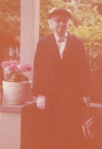
Great-Grandma on her porch in Wausau, Wisconsin. |

A mere 60-or-so years and everything is tinted red. And it has nothing to do with politics.
What’s happened to our Red Slinky? Both the bottom and the top of the slinky have come unhooked from the ends of the stick. And you know what happens when you unleash a stretched slinky. It gets smaller. It shrinks. What used to be deep red is now a middling red because the bottom of the slinky has shrunk up to somewhere near the center of the stick. What used to be white at the top of the slinky has shrunk down to where it is a little pink. Our slinky used to cover the full range, but time has changed it so that it only goes from the low end “sorta” red to a high end “kinda” pink. This color nomenclature is an international standard. Crayola doesn’t use these terms because they are too technical.
 But it’s not just our red slinky that has been affected by time. Both the Blue and Green Slinkies have also come unhooked. The shrinking is similar, but not as bad. The bottom of the Green Slinky stays almost hooked, but the top moves down a bit. The Blue Slinky does the same, but the top moves farther down toward the middle.
So the red moves way up toward white, and both the green and blue move toward dark. And the print ends up with a reddish cast, particularly where it should be close to white, like on white shingles. Also, that sky that should be brilliant light blue is now mauve, because the blue dye has faded more than the red in that area.
|
|
|
Gotta love a parade. Would love it more with proper colors. |

What do do, what to do!?! Use Vivid-Pix RESTORE software to correct the images after scanning, of course, but also, let’s try to make sure the prints never get to this point, or at least don’t get any worse.
But that’s the subject of another post, which is coming soon, if I don’t fade away.
— — —
*Yeah, I know, newspapers usually fade to yellow. That’s why the example is a picture of the clipping.
** The strict definition of “fade” is to become more faint and eventually disappear. This is happening, but there is also something else going on. Color tints result from unequal fading in the different colors.
*** As with any analogy, the slinky dyes are not 100% analogous. There are additional factors including the difference between reflectance and illuminance, scanner auto exposure algorithms, reciprocity, and the human visual system response to color. You didn’t really want to read about all of that, did you? Good. I didn’t want to write about it, either.
**** “Play it, Sam.”
|
|
|
Great-Grandma much more as I remember her, |
